Pages

Showing posts with label mica powders. Show all posts

Tuesday, June 2, 2009

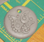
Paisleys and dots


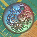
Applying color theory to creating a colorful paisley and dot pendant.

This pendant takes approximately 1/4 of a standard sized block of polymer clay. Using a neutral color, condition and roll out a section of clay. Roll your section on the second or third to largest setting of your pasta machine. (The largest for my machine is a 7-I rolled my clay at 5).
Fold the clay over on itself and lightly press together--doubling the thickness, and removing any air bubbles.

Place a sandwich baggie smooth over the surface of the clay. Press into the clay, through the baggie, with a round cookie cutter-about 2 inches in diameter. The sandwich baggie makes a nice beveled edge to the cut shape.

Roll the remaining clay back thru the pasta machine, at the same setting. The remainder of the shapes will be cut from a single layer of the clay.

Using a small round Kemper punch cut out several small dots. Roll these into small balls. Using the small round punch, cut a hole into the top of the pendant base. Approximately 1/4 inch from the edge.


Using a small tear drop shape cookie cutter, cut 3 shapes. Use your fingers to gently curve the tear drops into paisleys.


Arrange the paisley shapes and dot balls in a pleasing arrangement. For smaller dots cut the  punched dots in half.


Place a hot set crystal on one of the larger dots as accent bling. Use the tip of a knitting needle to push accent dots into the centers of the clay dots, and along edges of shapes.


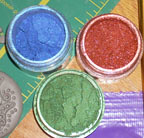
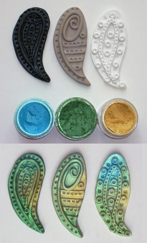
Use color theory principles to help select pigment powder colors. Apply colors loosely with soft brush. Do not inhale the pigment particles, cover your mouth and nose, and use in a well ventilated area.

Cure following the polymer clay brand's instructions. When cool brush off any excess pigment powders and coat with Varathane, or your polymerclay coating of choice to protect the mica pigment colors on your design.

Sunday, May 3, 2009

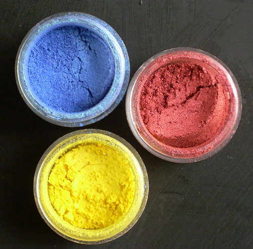
Color theory with mica pigment powders

Color theory is the study of mixing color and the visual impact of certain color combinations. There are many aspects to be taken into consideration when studying color. The form of the color —opaque pigment, translucent inks, transparent light—impact how colors interact and mix.

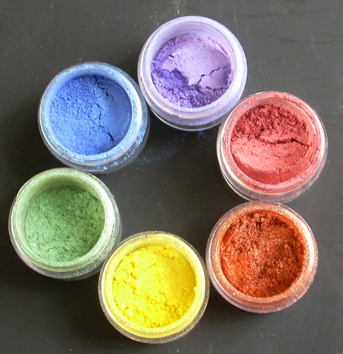
Mica pigment powders are ground natural mineral (mica) flakes coated with and oxide, usually titanium or iron. The granules of the flakes are solid and reflect light; therefore they are discussed in terms of opaque pigments.


There are three primary colors when dealing with opaque pigments: red, yellow, and blue. These are base, or pure colors. These colors, or hues, cannot be achieved through mixing.


Hue is the name of a color (red, purple). It's easy to remember: Hue and Hugh are both names. Hue is a color’s name, just as Hugh is a man’s name.


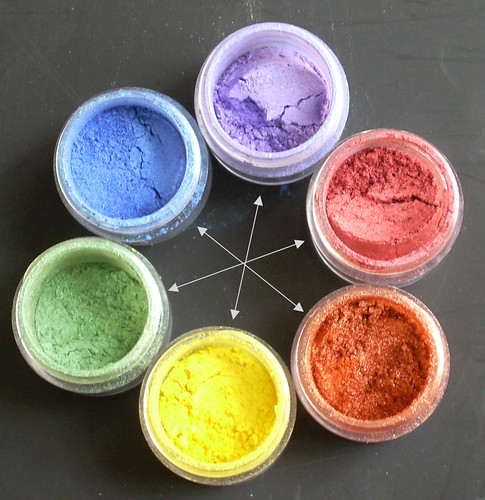
The three primary hues are the basis of the color wheel. Think of a rainbow in a circle, showing the range of hues that can be created when the primary colors are mixed. A basic color wheel shows primary and secondary hues. Secondary colors are achieved by mixing two primary colors.


Yellow+ red= orange
Red+ blue=violet
Blue+yellow=green


Tertiary, or intermediate, hues are the next level of color blends.


Green+blue=aquamarine


Analogous colors are hues that are next to each other along one side of the color wheel. Think of the colors as being in “rainbow order.”


Complementary colors are in opposite positions on a color wheel.


Blue-orange

Yellow-violet

Red-green


Split complementary hues are colors that are in opposite position on a color wheel, with one of the colors of the pair, shifted to the left or right


Aquamarine-orange

Indigo-yellow


Tints and shades are achieved by mixing a pure hue with white or black. Tints are lighter, and shades are darker. Tints can be achieved with mica pigments on clay by varying the quantity used. Both tints and shades can be achieved through blending pigments together.

There are many ways to help with the selection of color combinations. Magazines frequently will publish color pallets (a selection of hues) that they predict will be the season's popular colors, or are currently the popular colors. Keeping notes in your sketch book of color combinations you have seen and like, will help on future projects. Color choice is always going to be subjective, simply because different people favor certain hues over others.

Analogous colors are always pleasing combinations. An analogous range can be created with a “jump” or skip over a single color in the range.

To “jazz-up” a selection of analogous hues, add an accent color – such as in the example:

Yellow-aquamarine-blue (green was skipped)


Accent colors work well when they add contrast. A good way to achieve this is to select a complementary color.

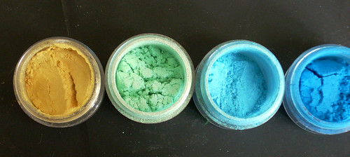
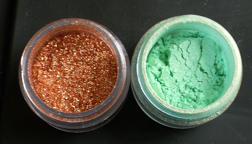
Pure complementary colors can be a bit jarring—think of bright red and green together. A modified complementary combination can be quite pleasing. Using a combination of split complementary with tints of the hues create very successful combinations. Copper and turquoise are a good example of this: copper represents the orange hue and turquoise is a tint of the aquamarine hue.


When planning on using mica pigments, the clay body color needs to be taken into consideration. The hue of the clay body will impact the tint and intensity of the applied mica pigments. Colors will not appear as bright on white as they will on black. Using a neutral base will give a more subtle effect.


When using colored clay make pigment selections based on analogous hues. Using complementary hued pigments on colored clay will dull down the overall appearance. Interference, or color shift, pigments incorporate a bright accent hue- so the pigment seems to shimmer in a different color. Frequently the shift is to a complementary hue, or using a bright color on a colorless base. These are great for adding “jazz.” You need to pay attention to the shift color when using interference pigments. You don’t want to lose an exciting color shift by applying the pigment to a base clay the same color as the interference shift. Applying a color-less interference powder with a complementary color to a colored clay base will not dull the overall appearance but add the “oohhh aahh" effect.

Pigments can be blended to achieve almost any hue on the color wheel. Warning: when blending colors limit how many you use. Too many colors mixed together tend to end in a muddy color. Blending of complementary colors will also result in a mud color. Mica pigments are available commercially for the arts and crafts industry. Mica pigments make-up is also available, and can be used on polymer clay. Expanding into the world of powder and pressed powder eye shadow expands the range of hues and tints available. There are so many hues available it's almost not necessary to every need to blend pigments.

Always use mica powders safely. Use in a well ventilated area, and protect your lungs by wearing a face mask. Mica pigments are made from minerals and oxides, not something you want to inhale.

Saturday, January 24, 2009

Art Cards


4 ACEO
Originally uploaded by Zoeowyn
Im not a big art card maker. But I do try, and they are this months challenge in PCAGOE, and I do try to participate in the ones that are a challenge to me. I find the challenges help push me out of my comfort zone, making it larger.
So, I made art cards.
The top winged heart, and the filagree heart under that one both burned. I was bummed. later I decided to white wash them, instead of doiing a darker antiquing the way I usually do. I must say i was surprized. The white wash gave the cards a nice shabby chic look.
The mica powdered covered heart was my next attempt. Its not finished. It may never be finished. See all those lumps and bumps? Well, it boiled up during the curing process. I guess my toaster oven in the garage in the middle of winter is not such a good idea, it obviously could not maintain a constant temp, and most likely had temp spikes. Oh well. The hubby said sell it anyway no one will know. Doink--I will! He can be kinda thick sometiimes!
The last one is my attempt at steam punk. I think it turned out a bit more industrial than steam punk, but Im on my way. It is the card I selected as my entry piece for the challenge.

The challenge will be up and available for voting next week at http://www.pcagoe.com

Monday, April 28, 2008

Evolution, maybe, then again


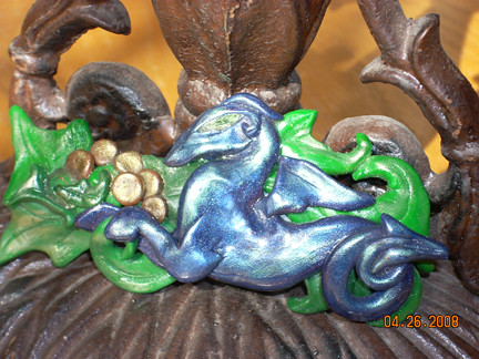
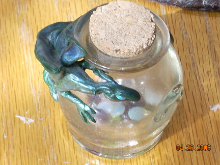
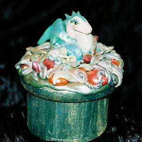
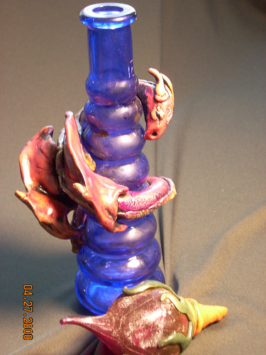
I've been making dragons out of polymer clay for over 15 years now. The blue dragon on the hair clip, is possibly my first one. And the little guy with opal eyes guarding the gems is possibly my first dragon bottle.
As Ive made protecting dragons Ive notcied a few things have changed.
One is the size, Im just getting bigger and bigger. Im also adding in more detail. Detail really makes the design more complete.

One thing that hasnt changed is the mica/luster powder finishes. Ive been utilizing that means of enhancement the entire time, and whats interesting, Im still using the same case of shimery eye shadows I used when I started. I still have them, they are from a gift with purchase make up kit from princess borgesia that I got in 1990/91. They still work great!

Tuesday, April 22, 2008

Paisley bubbles and dots pendants class

May 4, Sunday: Polymer Clay Paisley Pendants (1:00 p.m.-3:00 p.m.)

Great Paisly Pendants you can wear with panache! Learn how to cut, layer, and texture with this fun project. Polymer clay is an affordable and fun medium to dabble in. Join instructor Laura Medeiros in all the fun. Cost: $40; supplies additional cost and purchased from instructor. Note: 2-student minimum required for this class, please call and reserve your space!

Class location:

Stardust Designs Bead Shoppe
43 Brookwood Terrace
Nashville, TN 37205
Phone: 615-352-5355

Across from Target on Whitebridge Rd.
Behind Mr. Whiskers