Pages

Tuesday, May 20, 2008

Shifting to neutral


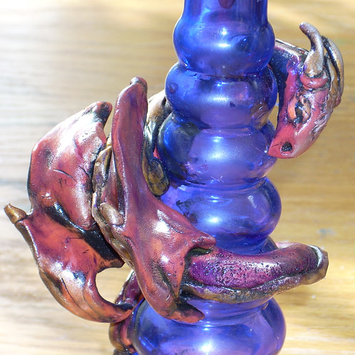
neutral
Originally uploaded by Zoeowyn
Or, what is that color anyway?
Its more grey than brown, and more brown than grey. It may lean a little toward green, but then again maybe its leaning toward purple. It definitely not grey because grey is a mix of black and white, this color seems to be some muddy mess including all colors, with out actually being a color. Its "color neutral." Some people call it taupe. This non-color- color comes in a limited range of shades, because once it gets too dark it is definitely a brown, and once too light it becomes a bisque/ivory tone.
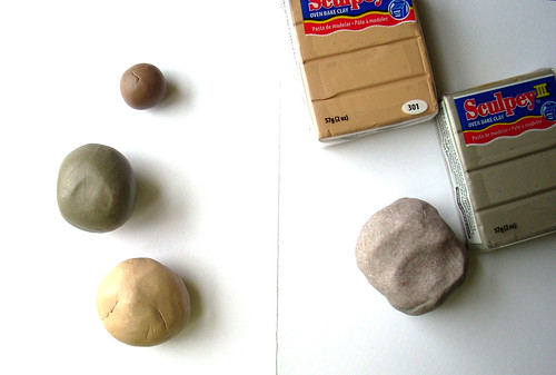

Now with all of the wonderful colors available in polymer clay would anyone actually want to work in "color neutral?"
That’s simple, when the clay is a base for a surface treatment. Color neural won't cause any adverse effects to the treatment color, it just lies there and "takes it," and lets the surface treatment be focal. Then again, there are times you just need mud.
Shades of grey wont cut it for mud, and the shades of grey are infinite. Yes grey is a neutral, so is black and so is white. Black and white are extremes and will alter the surface treatment results.
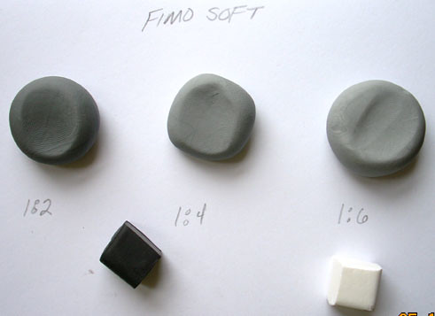
Grey is the extreme neutral, but it can also be "flat" and "colorless." It's not so simple to get a basic 50% grey.
That’s a grey that is perfectly balanced between the light of white and the dark of black. The pigmentation in black is intense. Be prepared to need more white than black. Also, add little bits of the black to the white as you blend. This will help control the sheer quantity you blend, as well as give you better color control.
Color neutral has some color body to it, so its not as flat. Like grey they are many shades, but they are in a smaller range. There are a few commercial color neutrals available to purchase, but the real fun is in blending your own. This is a great way to use up any scrap you may have. The best neutral colors come from blending a bit of everything.
It helps to be familiar with your color wheel when blending a neutral color.
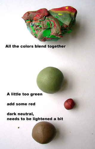
Colors that are opposite on the wheel, complimentary colors, not only do these colors look great together, but when they are blended together they cancel each other out. This is good to know so that when you blend your pile of scrap, and notice that your "neutral" is a bit too green, you can add a red based color to even it out.
Now that you have blended your neutral color what can you do with it?
I like my color neutral clay to be a base for colored mica pigments. The pigment colors really show thru with out seeming "neon" like they do when on a black clay base.

Saturday, May 17, 2008

Interview!


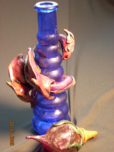
dreambottles
Originally uploaded by Zoeowyn
I've been interviewed!
http://www.pcagoe.com
I am the member interview of the moment
yeah me!

Thursday, May 1, 2008

PCAGOE May Challenge Entries


PCAGOE May Challenge Entries
Originally uploaded by divadea
Hi folks its time to go vote at www.pcagoe.com
select your favorite floral item...I know this month is hard, Im cant vote as a member, but I really dont know which I would pick, after all they are all cool!
My top three:
the card in column D Row 2
Light switch column B Row 6
Fairy girl column A row 7

Monday, April 28, 2008

Evolution, maybe, then again


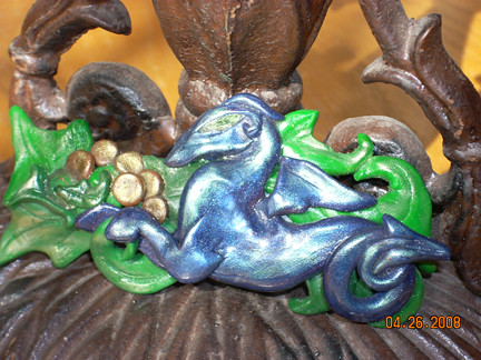
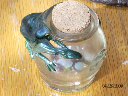
I've been making dragons out of polymer clay for over 15 years now. The blue dragon on the hair clip, is possibly my first one. And the little guy with opal eyes guarding the gems is possibly my first dragon bottle.
As Ive made protecting dragons Ive notcied a few things have changed.
One is the size, Im just getting bigger and bigger. Im also adding in more detail. Detail really makes the design more complete.

One thing that hasnt changed is the mica/luster powder finishes. Ive been utilizing that means of enhancement the entire time, and whats interesting, Im still using the same case of shimery eye shadows I used when I started. I still have them, they are from a gift with purchase make up kit from princess borgesia that I got in 1990/91. They still work great!

alcohol inks


dragon
Originally uploaded by Zoeowyn
There once was a little dragon who was unhappy with his color. Hes was a bright bright orange. After he took a bath in assorted acrylic paints and rolled around in some buffing wax he was still unhappy with his color....

I never really used alcohol inks for anything other than a "paint."
Then it hit me upside the head "alcohol," I could use rubbing alcohol to thin it out!
I soaked a q-tip in alcohol then in the indigo colored ink. It worked great!
the colors on the dragon, intermingled with what was left of the acrylic paints, and the range of colors from just a few dabs of ink were amazing

So to end the story
the little dragon turned out quite pleased with his new range of colors.

Tuesday, April 22, 2008

Paisley bubbles and dots pendants class

May 4, Sunday: Polymer Clay Paisley Pendants (1:00 p.m.-3:00 p.m.)

Great Paisly Pendants you can wear with panache! Learn how to cut, layer, and texture with this fun project. Polymer clay is an affordable and fun medium to dabble in. Join instructor Laura Medeiros in all the fun. Cost: $40; supplies additional cost and purchased from instructor. Note: 2-student minimum required for this class, please call and reserve your space!

Class location:

Stardust Designs Bead Shoppe
43 Brookwood Terrace
Nashville, TN 37205
Phone: 615-352-5355

Across from Target on Whitebridge Rd.
Behind Mr. Whiskers

Monday, April 14, 2008

Style


Sky Captain and the World of Tomorrow.
This takes place in an alternative 1939. Stylistically would you call it deco-punk? or streamline-comic?
Whatever the style I LOVE IT. The film was created all "green-screen" based technology, there ya go that's the techie stuff. Lets talk about style. it takes all the best of the original King King (I say that one scene WAS the back ground from the original KK movie on Kongs island), then add some Flash Gordon, toss in some Metropolis, knead in some Lost Horizon, take a Journey to the Center of the Earth stir well with American stream line and art deco, and baste in comic book art.
It was awesome!
I think the movie was ok, after all Angelina Jolie was dead sexy with that eye patch, too bad there wasn't an equivalent male character--the guy who plays Sky Captain = yeah ok whatever, and stylistically he did not fit! He was not comic book hero style, too thin too weak jawed. Gweneth Paltrow was the brassy heroine, could have been brassier. Angelina, wasn't in the movie long enough to weaken her character, same with the quirky scientific side kick- he was plucky and smart mouthed and geeky.
The plot included everything from kid napped Russian scientists, flying robots, ray guns and miniaturized elephants, there is also a mysterious bad guy.
I wanted to see this when it first came out, but life got in the way. I found the DVD at some flea market for $2, cheaper than renting, so it was mine.
I only now got around to seeing it.
I let it play 3x while I created some jewelry.
I will become one of my favorites to work to, my biggest problem is I will really want to see the visuals.
And it will be great for the kids, child safe, and a great way to entice them to watch some old classics