Color theory is the study of mixing color and the visual impact of certain color combinations. There are many aspects to be taken into consideration when studying color. The form of the color —opaque pigment, translucent inks, transparent light—impact how colors interact and mix.
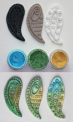
Mica pigment powders are ground natural mineral (mica) flakes coated with and oxide, usually titanium or iron. The granules of the flakes are solid and reflect light; therefore they are discussed in terms of opaque pigments.
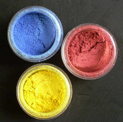
There are three primary colors when dealing with opaque pigments: red, yellow, and blue. These are base, or pure colors. These colors, or hues, cannot be achieved through mixing.
Hue is the name of a color (red, purple). It's easy to remember: Hue and Hugh are both names. Hue is a color’s name, just as Hugh is a man’s name.
The three primary hues are the basis of the color wheel. Think of a rainbow in a circle, showing the range of hues that can be created when the primary colors are mixed. A basic color wheel shows primary and secondary hues.
Secondary colors are achieved by mixing two primary colors.
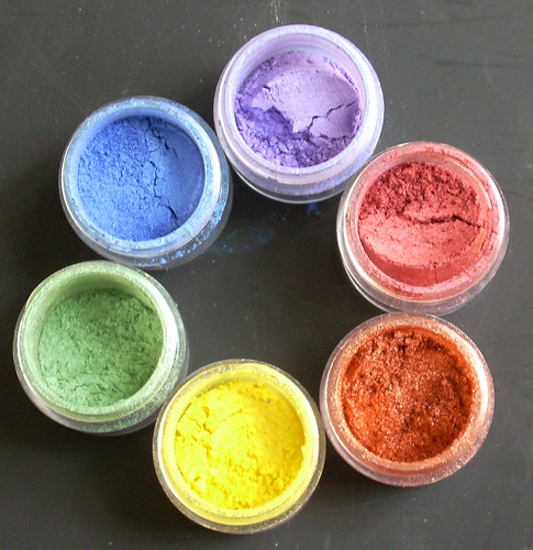
Yellow+ red= orange
Red+ blue=violet
Blue+yellow=green
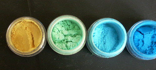
Tertiary, or intermediate, hues are the next level of color blends.

Green+blue=aquamarine
Analogous colors are hues that are next to each other along one side of the color wheel. Think of the colors as being in “rainbow order.”
 Complementary colors
 are in opposite positions on a color wheel.

Blue-orange
Yellow-violet
Red-green
Split complementary hues are colors that are in opposite position on a color wheel, with one of the colors of the pair, shifted to the left or right

Aquamarine-orange
Indigo-yellow
Tints and shades are achieved by mixing a pure hue with white or black. Tints are lighter, and shades are darker. Tints can be achieved with mica pigments on clay by varying the quantity used. Both tints and shades can be achieved through blending pigments together.
There are many ways to help with the selection of color combinations. Magazines frequently will publish color pallets (a selection of hues) that they predict will be the season's popular colors, or are currently the popular colors. Keeping notes in your sketch book of color combinations you have seen and like, will help on future projects. Color choice is always going to be subjective, simply because different people favor certain hues over others.
Analogous colors are always pleasing combinations. An analogous range can be created with a “jump” or skip over a single color in the range.
To “jazz-up” a selection of analogous hues, add an accent color – such as in the example:
Yellow-aquamarine-blue (green was skipped)
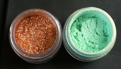
Accent colors work well when they add contrast. A good way to achieve this is to select a complementary color.Pure complementary colors can be a bit jarring—think of bright red and green together. A modified complementary combination can be quite pleasing. Using a combination of split complementary with tints of the hues create very successful combinations. Copper and turquoise are a good example of this: copper represents the orange hue and turquoise is a tint of the aquamarine hue.
When planning on using mica pigments, the clay body color needs to be taken into consideration. The hue of the clay body will impact the tint and intensity of the applied mica pigments. Colors will not appear as bright on white as they will on black. Using a neutral base will give a more subtle effect.
When using colored clay make pigment selections based on analogous hues. Using complementary hued pigments on colored clay will dull down the overall appearance. Interference, or color shift, pigments incorporate a bright accent hue- so the pigment seems to shimmer in a different color. Frequently the shift is to a complementary hue, or using a bright color on a colorless base. These are great for adding “jazz.” You need to pay attention to the shift color when using interference pigments. You don’t want to lose an exciting color shift by applying the pigment to a base clay the same color as the interference shift. Applying a color-less interference powder with a complementary color to a colored clay base will not dull the overall appearance but add the “oohhh aahh" effect.
Pigments can be blended to achieve almost any hue on the color wheel. Warning: when blending colors limit how many you use. Too many colors mixed together tend to end in a muddy color. Blending of complementary colors will also result in a mud color. Mica pigments are available commercially for the arts and crafts industry. Mica pigments make-up is also available, and can be used on polymer clay. Expanding into the world of powder and pressed powder eye shadow expands the range of hues and tints available. There are so many hues available it's almost not necessary to every need to blend pigments.
Always use mica powders safely. Use in a well ventilated area, and protect your lungs by wearing a face mask. Mica pigments are made from minerals and oxides, not something you want to inhale.
